A 3 bedroom garden apartment in Glebe was ripe for renovation after being rented out for the last 25 years. The interior was extremely dated and the colours too dark for the space. Even though the apartment was north facing, the use of green colour palette for carpet, doors, walls and blinds made the apartment appear dark and dingy.
The task was to not only update the apartment but to make it light and bright and increase the storage space as much as possible. The owners were planning to re-let the apartment again and so the aim was to ensure the selected materials was robust enough for use by tenants.
It was a case of gutting the apartment and replacing everything from floors, kitchen, bathrooms, blinds, lighting, door handles and power points.
BATHROOMS
Before: The existing main and ensuite bathrooms had a green and white colour scheme with a patterned border wall tile; the shower area had a tiled surround.
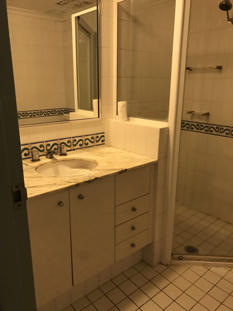
Bathroom – BEFORE
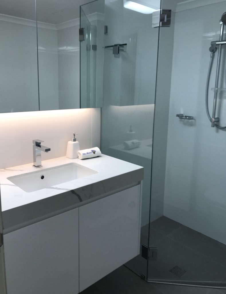
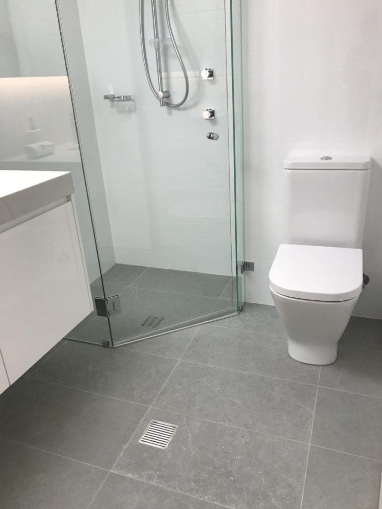
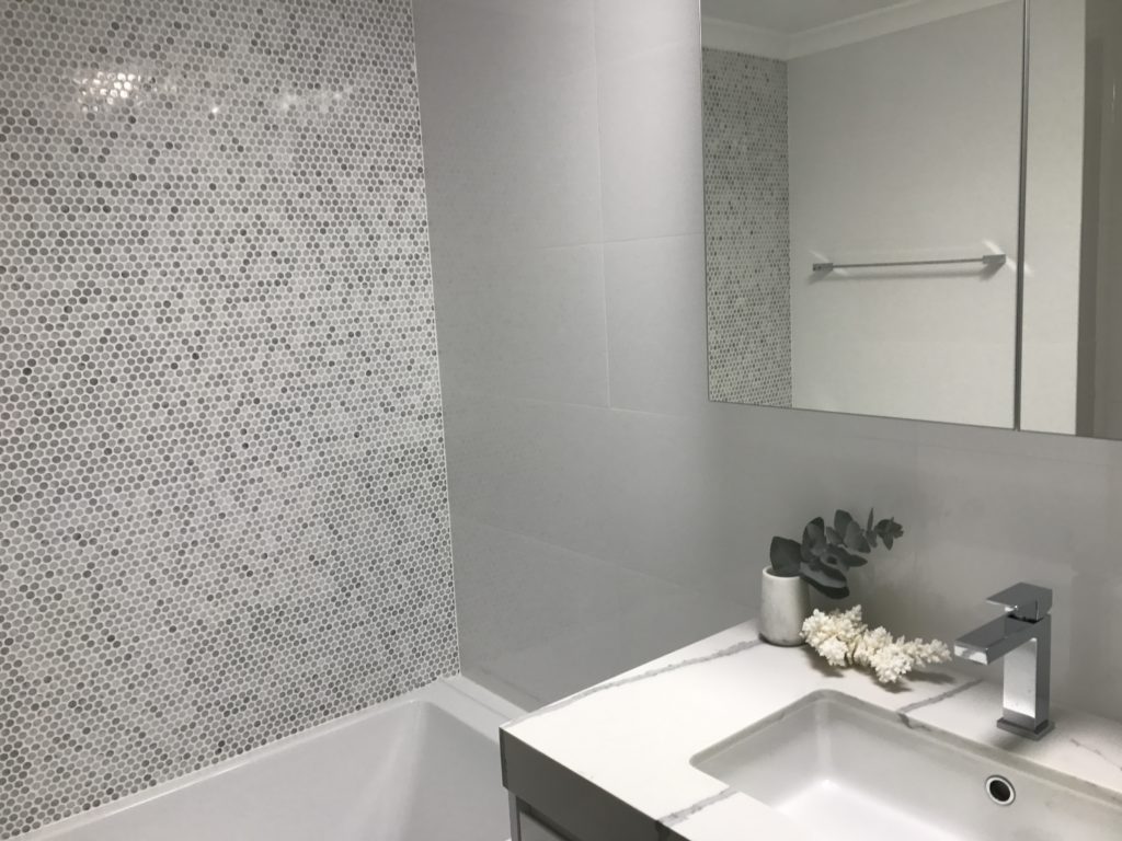
After: This was replaced by soft grey and white colour palette. The use of the gorgeous Calcutta marble penny royals as a feature wall behind the bath in the main bathroom really lifted the space.
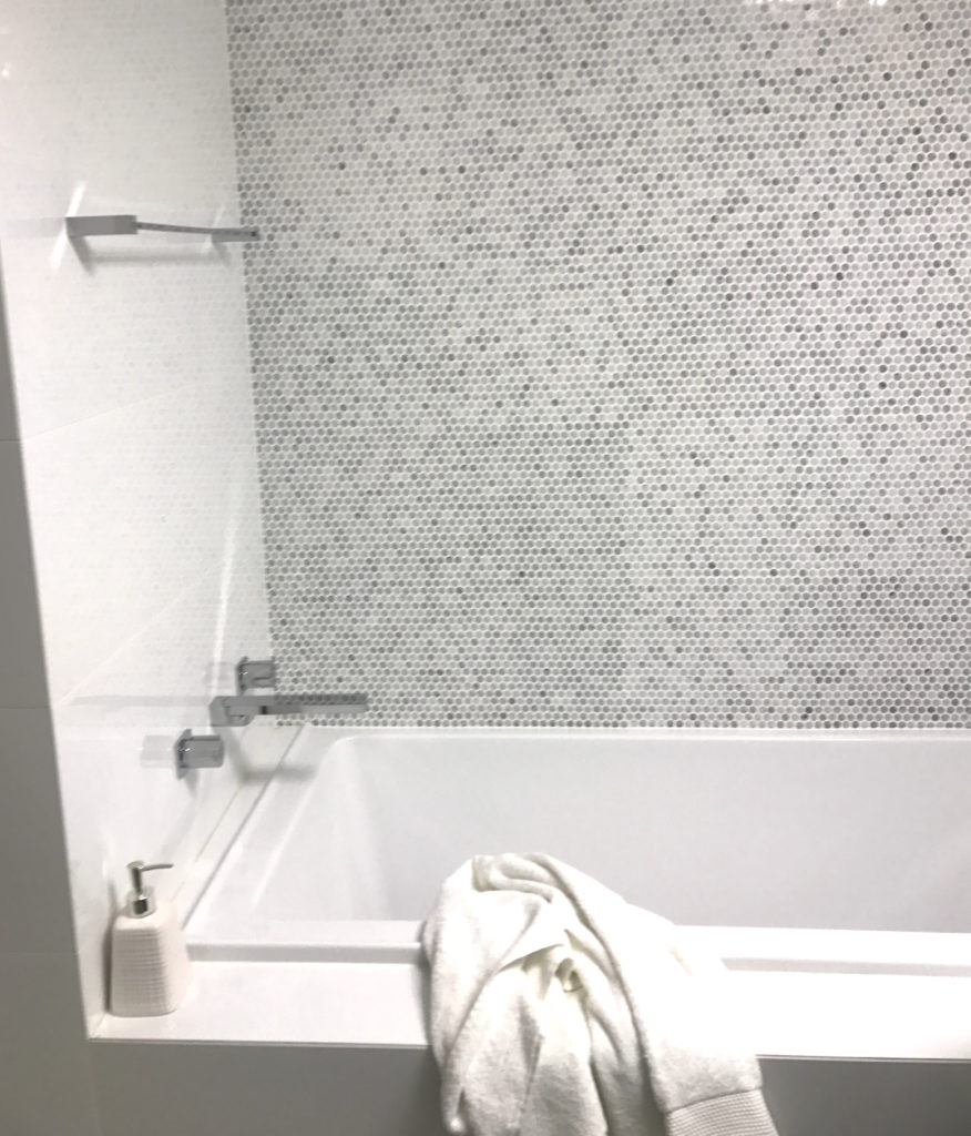
Feature wall – main bathroom
Both bathrooms benefitted from installation of frameless shower screens, custom built CaesarStone vanities and shaving cabinets with LED lighting.
KITCHEN
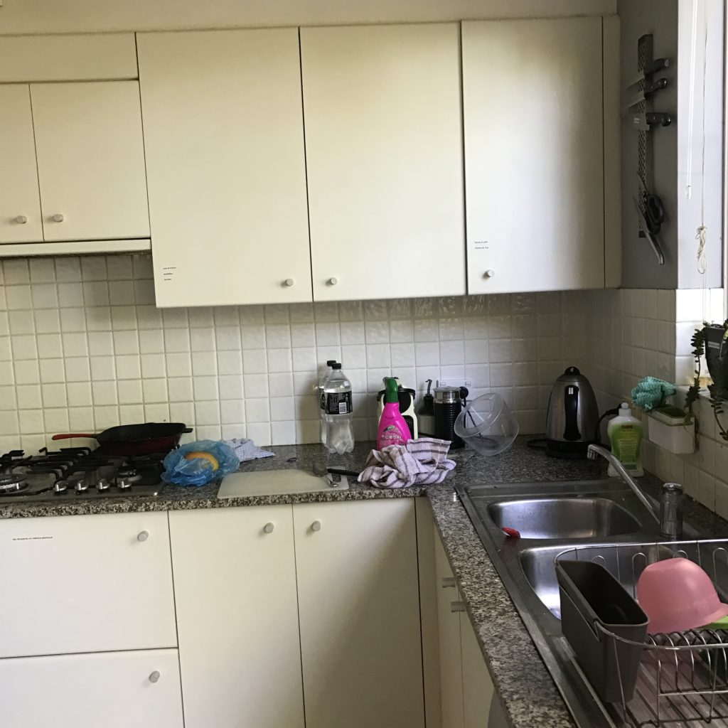
Before: The kitchen was separated from the combined living/dining room by a door. It had dated vinyl floor, dark granite bench top and tiled splash back.
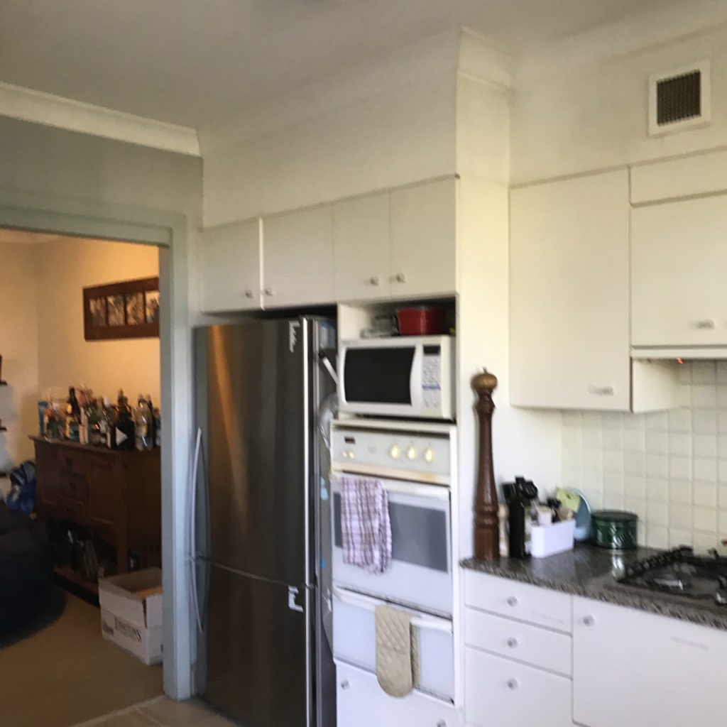
kitchen entry
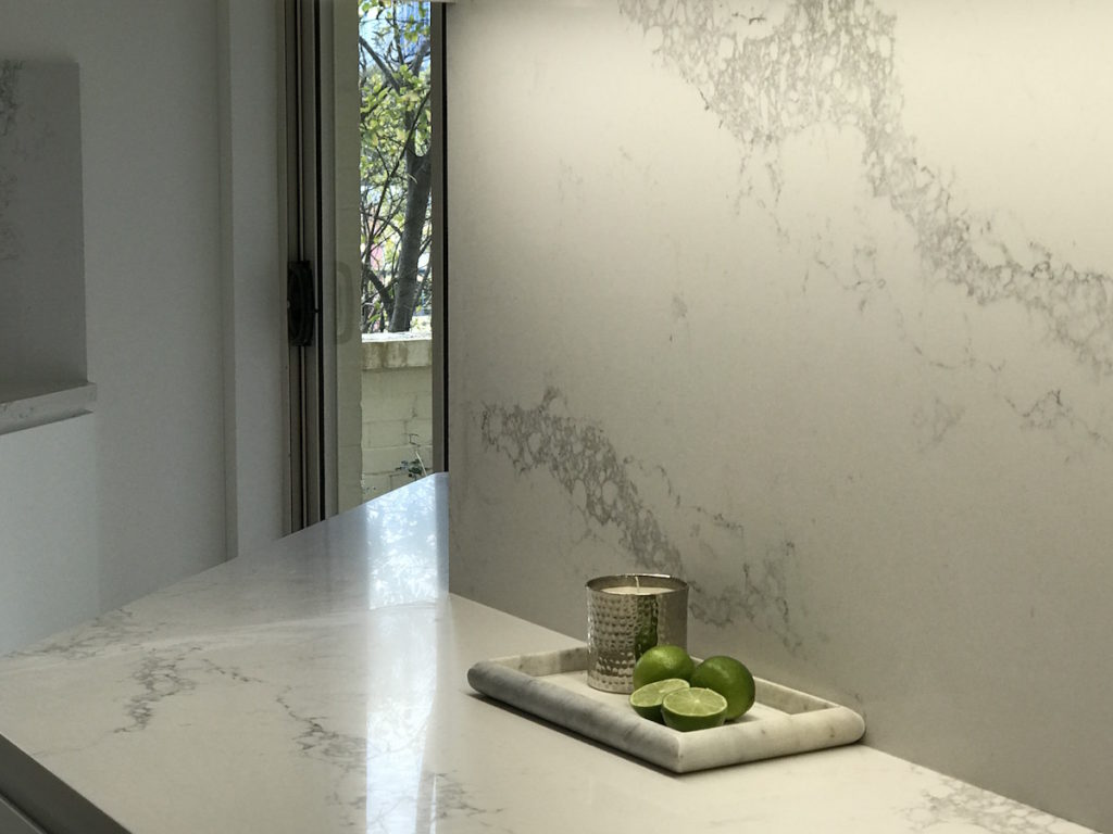
After: The door and the non-load bearing wall was removed. The kitchen was gutted and the flooring replaced. CaesarStone Statuario Maximus countertops and splash backs were installed.
Polyurethane cabinets in Dulux Vivid White satin finish (and with LED lighting to illuminate the countertop) replaced the old kitchen cabinets. Miele kitchen appliances including an integrated Miele dishwasher were installed. Blum fittings were used in all the cabinetry.
Wherever possible, extra storage was incorporated into the existing space.
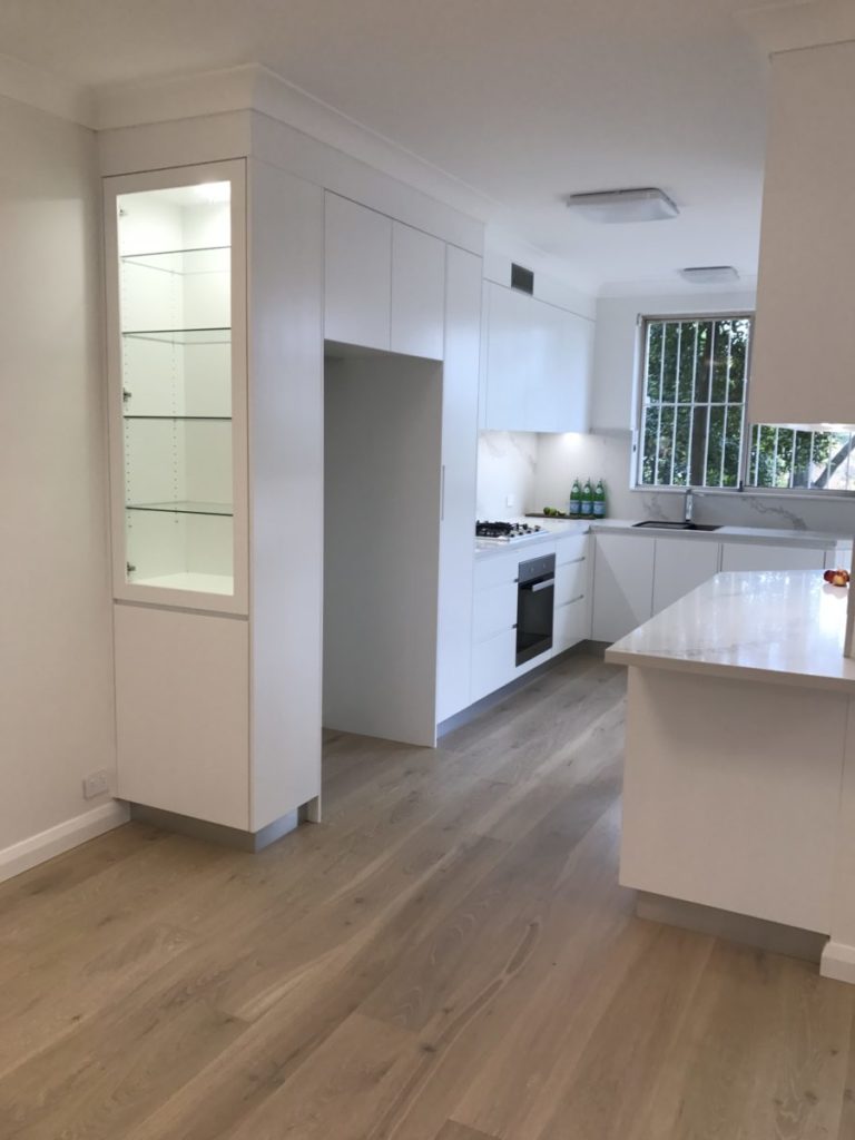
Kitchen – AFTER
FLOOR & PAINT
The green carpet was replaced with Scandinavian Oak floating timber floor.
The green walls were replaced with Dulux White Polar Quarter (although it did take 3 coats to get rid of the greenish tinge!). The doors and trims and ceiling were painted in Dulux Vivid White.
GARDEN
The small outdoor area required attention as well. For some unknown reason the developer had tiled only half the outside area and there was a dip of about 10 cms to a lower area. This resulted in the lower half being unusable space.The plants may have been trendy in the nineties but 25 years later, they looked inappropriate and not the best choice – especially for tenants with small children.
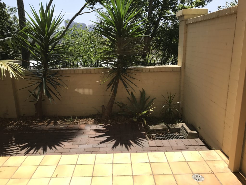
Garden – BEFORE
The ground level was increased and levelled all the way to the hedge. Terracotta tiles were replaced with taupe travertine tiles. Murraya plants were used since they are low maintenance and will eventually grow into a low hedge – low enough to be able to see the city and the Sydney Harbour Bridge at a distance. The ugly grate on the right hand side (which had to be left as is ) was hidden behind planters filled with buxus.
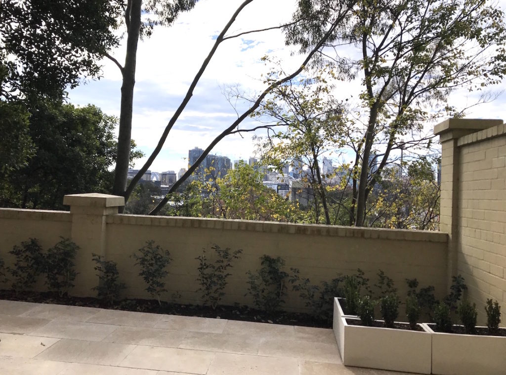
Garden – AFTER
The renovation went relatively smoothly. There were minor issues such as difficulty in finding the right size of exhaust fans for the bathroom, the water proofing in the bathrooms taking a long time to dry, finding a tiler who was willing to tile a very small outside area. But every renovation will always have a few challenges. As long as there is a good relationship between the Body Corporate, neighbours (!), owner and tradesmen it does all work out in the end.


Deja vu with a difference. Well done to the innovative designer…
Thank you Bernadette.
Great result. It appears that the brief was absolutely met with an ageless style the bonus.
Beautiful job!